What is your all-time favourite album cover?
Hard question. I have always really liked the Germs (GI) cover. It’s very simple and iconic for a punk record. I also like that the design is somewhat mysterious, which works well for a band that had to use a fake name in order to get shows. I am also fond of many classic album covers designed by Hipgnosis, mainly their Pink Floyd covers.
Is there a difference between designing a record cover and a tour poster?
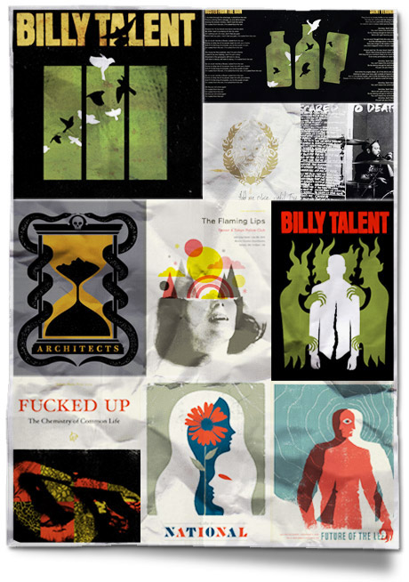
A record cover design needs to have longevity. It will represent the band and their music for a long time so it should be a solid piece of well thought out design. Since a concert poster is technically ephemera, it can be more spontaneous or fun. Sometimes a poster can succeed by representing the event more than the band(s). However, gig posters are considered art to many people these days. If someone is framing and displaying a poster on their wall, I think it should be a successful design that captures the essence of the band and their music.
Do you listen to the album before beginning to work on the cover?
We usually listen to the band during early concept development and even throughout the design stage. I think it’s important to get a good feel for the band and what their music is all about. We also read lyrics and interviews to help dig up and understand the themes found in their songs. This makes it easier to come up with imagery that will work for the band and album.
Are the musicians usually very involved with the initial creative process?
It depends. Bands usually come to us with a couple of loose ideas or direction for the design, especially with album artwork. Once in a while, a band will ask us to come up with our own ideas. We usually have complete creative control with gig posters. The band just approves or disapproves the design in the end.
Do you find musicians tend to be more opinionated in terms of the creative, or less so?
Musicians are usually more open to design that is a bit different or edgy. Clients that are more corporate usually want the design to be friendly, safe, easy to take in and understand. Both tend to be opinionated to a degree. Every client wants to be happy with the finished product.
What makes a good record cover?
A design that suits the band and illustrates the overall tone or vibe of the album. It should give the viewer an idea of what the band sounds like without having to hear them. It should also be striking and stand out in some way to catch the attention and interest of people who aren’t familiar with the band.
Which designers out there right now do you most admire?
Aesthetic Apparatus, Heads of State, Patent Pending, Alan Hynes, Invisible Creature, and The Small Stakes all specialize in music graphics and produce great work.
What inspired you to specialize in music graphics?
Mostly just collecting records while growing up, seeing gig posters around town and in records stores, going to concerts and purchasing merch from bands, knowing people who were doing it, etc… We have always been interested in art and music so it made sense for us to combine the two.
What are your top 3 albums so far for 2010 and do they match your top 3 album covers?
For both music and design:
Deftones – Diamond Eyes
The Black Keys – Brothers
Thee Oh Sees – Warm Slime
If you could redesign a cover for any band, which would it be?
I’m not overly fond of any of the artwork but The Black Keys art is different and refreshing.


