What is your all-time favourite album cover?
Man, it would be really hard to peg it down to one. I rank the three classic Larry Carroll Slayer covers super high on my list (Reign in Blood, South of Heaven, and Seasons in the Abyss). These things gave me nightmares when I was a kid and I think that, if you’re Slayer, that’s a pretty good result. What sets these apart too is how different they are from what was going on at the time (bright airbrushed metal mascots for the most part).
Is there a difference between designing a record cover and a tour poster?
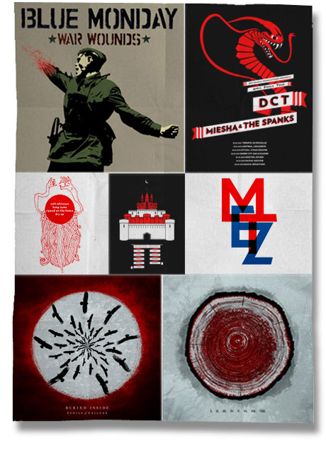
Both require creating visual representations of the music. One thing about a poster is that it has to communicate more information. Ultimately it has to get across the point that there is a show, this is the band that is playing, and here is where and when you can check it out. With a cover you are designing something with a longer shelf life – potentially something that will represent the album and band forever.
Do you listen to the album before beginning to work on the cover?
Ideally, I listen to the album before working on it. Music is expressive and when I listen to a record it’s easy to close my eyes and think about how it should look. Often because of the production schedule it doesn’t work out, in which case it’s a matter of talking with the band to find out what they are going for musically and aesthetically.
Are the musicians usually very involved with the initial creative process?
It depends on the musicians. Some like to give free rein, some give conceptual ideas and some push pixels until it’s exactly as they envisioned it. Typically what works best is a collaboration where the musician and designer come to a consensus before the designing begins. The hardest part is coming up with the idea, so it helps when you can kick around thoughts with the band.
Are the musicians usually very involved with the initial creative process?
They pay less and are ungrateful about your time! No seriously there is actually not much difference in terms of client personality. The work is typically more interesting because you can explore themes and aesthetics you don’t normally get to with commercial work.
What makes a good record cover?
Timelessness. It’s pretty easy to take what’s cool and ride that wave. It’s really hard to make something that looks as relevant today as it did when it was created.
Which designers out there right now do you most admire?
I’ve always appreciated people who can illustrate and design. Some of today’s standouts for me are Alex Trochut, Marian Bantjes, Morning Breath Inc., and Walse Custom Design.
What inspired you to specialize in music graphics?
All my friends were in bands and they needed things made for them.
What are your top 3 albums so far for 2010 and do they match your top 3 album covers?
Don’t check out too much new stuff these days, but I would say recent releases I’ve bought and loved both the artwork and music are Coalesce Ox (Invisible Creature), Obits I Blame You (Rick Froberg), and Doomriders Darkness Comes Alive (Thomas Hooper).
If you could redesign a cover for any band, which would it be?
I’d feel presumptuous redesigning someone else’s work. There are a lot of great albums with bad covers, but in the end it adds to the character of the record.


