There is a golden throne in the musical canon reserved for The Beatles’ Sgt. Pepper’s Lonely Hearts Club Band. Credited with maturing the sound of rock and roll as the 60s knew it, the experimental album ushered in a new era of music that was infused with as much of the surreal as the cerebral.
In the case of Sgt. Pepper’s Lonely Hearts Club Band, the cover alone was reason enough to suspect a genre maker in the presence.
Designed by British pop artist Peter Blake and his wife, American artist/sculptor Jann Haworth, the album was photographed by the late Michael Cooper, best know for his insider pics of the London music scene circa 1960, as seen through friendships with bands including The Rolling Stones.
Like the band it sought to capture, the album cover appeared as a seamless transition from old to new: a signal of the change to arise with the dawn of artists’ approval clauses, a shift in the aesthetics of a post-war generation, and a widening in the too-narrow realm of art.
Today, while the movie poster industry — blockbuster or independent alike — seems to have taken a handful of Ambien (see Spacesick’s online “I Can Read Movies” series should you want to see something that doesn’t look like it was taken at the Sear’s portrait gallery), a cluster of folk in the music graphics industry are steadily producing exciting album covers, created with art and communication in mind rather than uniformity and commerce.
Below, today’s new generation of graphic artists talk music, artist angst, and creative reverie.

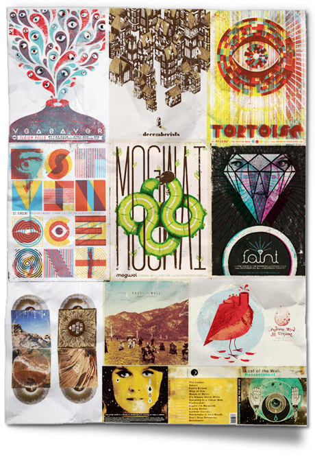
What is your all-time favourite album cover?
While I think I’m somewhat biased by how much I love the music, Sigur Rós’ ( ) album has to be one of the most perfect visual distillations of a band’s sound. It perfectly captures all the clichéd quotes describing their music: icy, cold, dynamic, earthy, mysterious, luminous, etc etc. I mean, the freaking album cover IS the name of the album!
Is there a difference between designing a record cover and a tour poster?
A record cover carries much more weight and importance than a tour poster. The art for an album needs to not only visually define ALL the content and mood and emotions of an album, but it actually needs to sum up a whole period for a band. It puts a face to an entire era of a band. A tour poster is much more of an advertisement for one specific event and is more free to explore only one facet of a band’s music. It needs only to fit into the whole, rather than define the band.
Do you listen to the album before beginning to work on the cover?
Oh yes! It’s absolutely one of the first steps that must be taken before I start any work on the art. Any visuals created without hearing the music itself seem to me to be fake and misguided. it would be like trying to design a poster for a movie you’ve never seen and don’t know any of the actors.
Are the musicians usually very involved with the initial creative process?
It seems to vary. Sometimes musicians have a very specific idea of what they want and just need someone who is on the same page with them. More often than not, musicians don’t seem to have any specific ideas in mind, but definitely know what they like when they see it.
Do you find musicians tend to be more opinionated in terms of the creative, or less so?
Nah, I don’t think musicians are really any different than other clients. Everyone’s a cheap bastard in the end.
What makes a good record cover?
I think good record covers are visual summations of both the band AND the album. I love when an album cover fits into the overall theme and mood of a band, but still conveys very specific information about the specific album.
Which designers out there right now do you most admire?
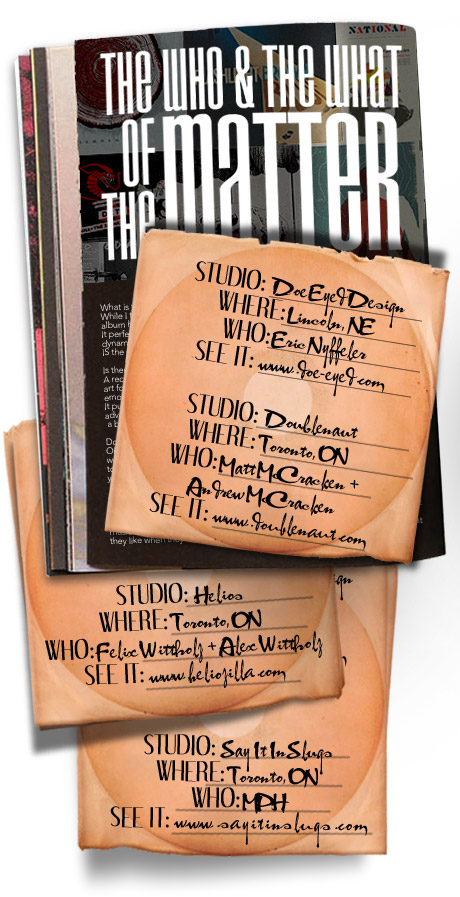
I’m a big fan of artists whose work finds a middle ground between illustration and design, such as Raymond Biesinger (from Edmonton, Canada), Doublenaut (from Toronto, Canada), The Silent Giants (Detroit, USA), Delicious Design League (Chicago, USA) and Young Monster (Chattanooga, USA). These guys step up the game with every new design they create.
What inspired you to specialize in music graphics?
When I was a dumb kid sitting in sixth grade, I spent almost every minute of the school day drawing logos and album covers for fake bands. A few years later, once I started to play in bands, I usually fell into the responsibility of handling our merch, posters, and album art. Doing art for other bands was just a natural extension of creating work for myself.
What are your top 3 albums so far for 2010 and do they match your top 3 album covers?
For music:
Extra Life Made Flesh – An insane mixture of avant garde rock, Renaissance music, and 80s pop, this album somehow manages to be simultaneously terrifying and hilarious.
East of the Wall Ressentiment – One of the catchiest heavy albums I’ve heard in years that somehow finds a perfect blend of technicality I did the design for the record, so unfortunately I can’t include it in my top 3 for design.
Xiu Xiu Dear God I Hate Myself – For an album with such a downer title, it has some surprisingly life-affirming songs.
For design:
Night of the Wolf 7 – The type and colors on this are so over the top. It’s totally one of the pieces that you just wish you designed every time you see it.
Cougar Den Keepondrifter – Aaron Horkey…nuff said.
Zs New Slaves – The art is totally as fucked up and off the wall as the band. Perfect for them.
If you could redesign a cover for any band, which would it be?
I’d probably redesign any of the albums by the weirdo, avant garde band Sleepytime Gorilla Museum. They have such an established visual direction (combining lots of faux-historical documents and textbook/academic graphics) but have never really gotten the artwork right. It rarely looks authentic enough and looks more like a fast Photoshop pastiche. I’d definitely stick in the same vein, but just do it better!
next page


